How to create a better website landing page so you get more leads
What makes a good landing page for an online service or application? I decided to look at the home pages of three successful online services and pick out the things that seem to represent good practice.
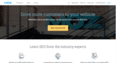
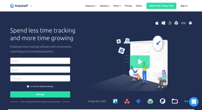
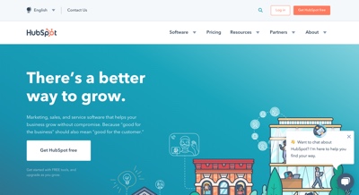
These are the sites:
The overall design (graphics, layout and text) of your landing page or homepage is critical. You want to convert visitors into enquiries, sign-ups and sales. That means getting your bounce rate down as low as possible (% of visitors who come into your site on a page and then leave without going anywhere else) and then persuading your visitors to fill in a form, pick up the phone or make a purchase.
10 things I picked out that might improve your website:
-
Graphic design matters. Good quality images, icons and other graphics keep people on the page for longer. It's really hard to turn around a poor first impression.
-
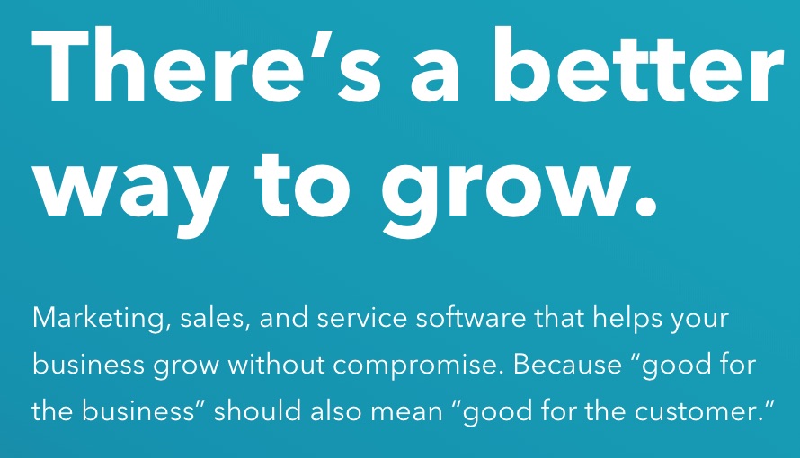
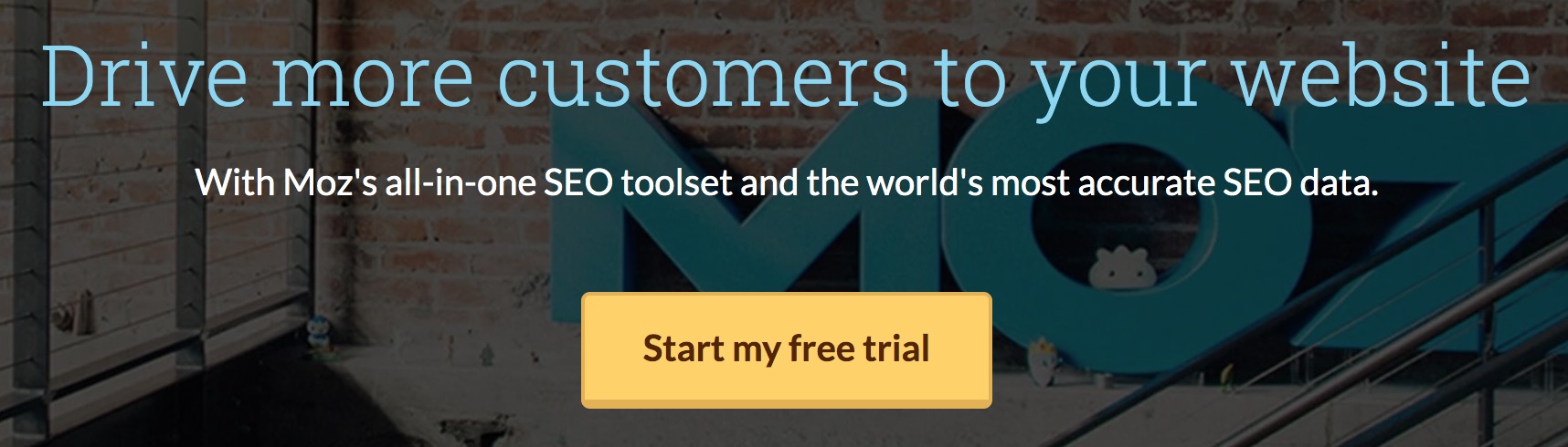
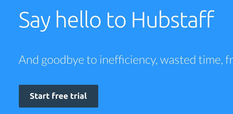
Good landing pages have a clear benefit statement at the top. The benefit statement comes first followed by a short, direct sentence that explains what the software or service does.
-
A call to action - 'Start my free trial' - in the top part of the page - no scrolling required.
-
A call to action near the bottom of the page - no need to scroll back up.
-
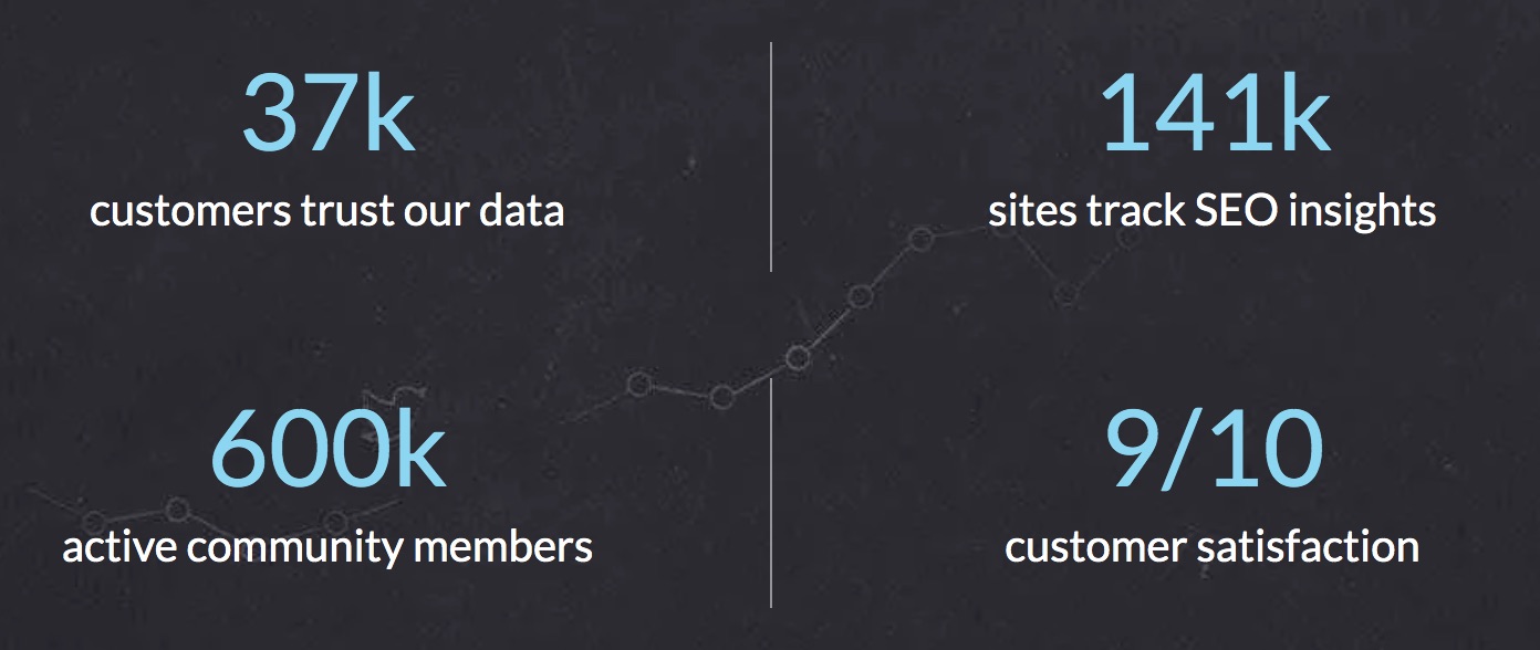
Numbers mean credibility. Numbers of customers, customer satisfaction ratings, visits to blogs etc.
-
A live chat widget. This might be optional because some people think they are annoying. I’d set this up, run it for a while, capture some data and see if it generates more leads.
-
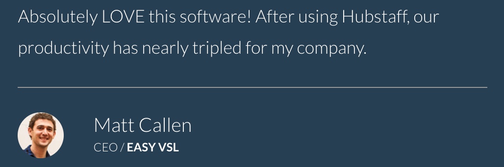
Evidence of real customers - very short testimonials and logos. One or two pictures of real customers together with quotes are good.
-
No pricing on the landing page. The three examples I looked at had clear ‘Start my free trial’ calls to action. Pricing is on another page.
-
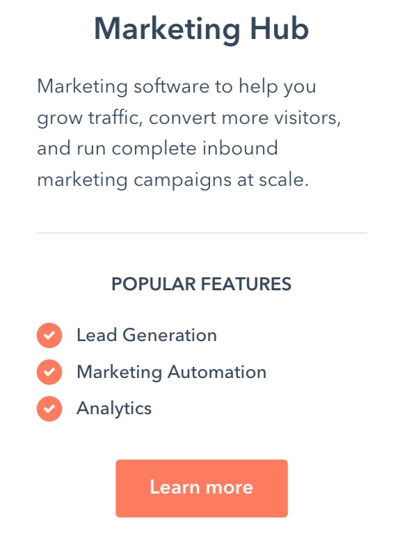
It’s ok to list features but descriptions should be very short - a short sentence with two or three bullet points per feature. Link to other pages for more detail. Another clear benefit statement across the top of the feature section is good.
-
A footer section at bottom of the page with links to other part of the site. Two of the three also had sign-up buttons in the footer. That made me realise that it’s ok to have 4 or 5 ‘Start my free trial’ or ‘Sign up’ calls to action on the same page.
Those three pages are deceptively simple. The trick is to get the words right - emphasize benefits, keep descriptions short (just a few words) and invite people to do things. Remember to sell the sizzle and not the sausage.
Related Posts
Course Design - Learn from YouTube and Build Successful Online Courses with Video
Online Course Marketing Ideas - Reach more learners - 5 simple ideas that work
Online Learning Technology Guide - how to deliver affordable online training
What does a bespoke learning management system cost?
Learning Japanese with Duolingo
How Could a Training Company Sell E-Learning Courses Online?