Power BI Cumulative Totals Measure - Visualising the Course Sales Pipeline
This is one way you can use the cumulative sales total measure I described in the previous post. I’ve used a bar chart visual to show how the total value of course enquiries, enrolments and lost opportunities change over time.
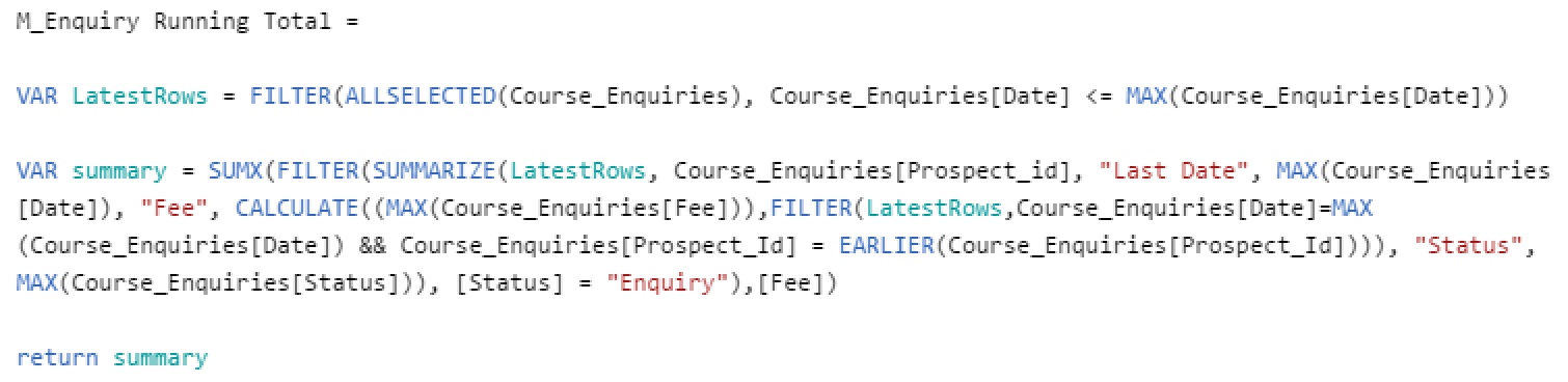
This is the DAX for the course enquiries version of the measure and my breakdown of how it works is here:
Power BI Cumulative Totals and Measures - Course Sales Pipeline.
There are three versions of the measure - enquiries, enrolments and lost opportunities - basically identical except for the filter they use on ‘Status’.
And here is how I’ve used them with a bar chart visual - the three versions of the measure show the shift over time as initial enquiries become either new course enrolments or lost opportunities.
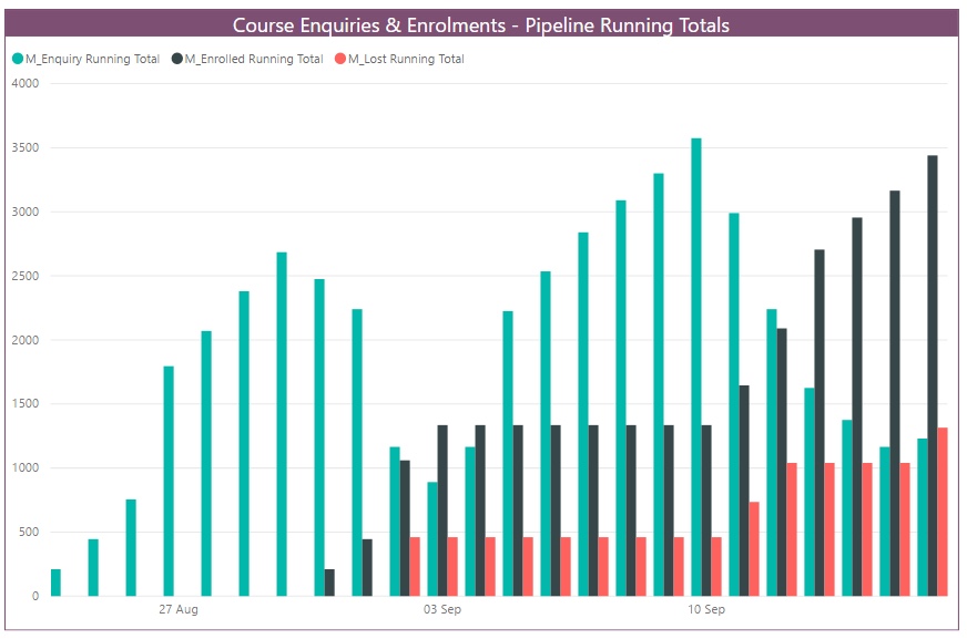
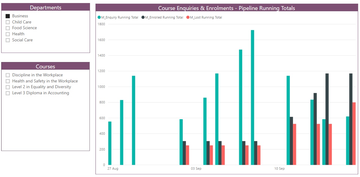
It’s also good simple example of how a measure works with filtering. I added two slicers to the report so the user can select a particular department and/or course. The measure recalculates based on the context set by the filter and bar chart changes to show only the enquiries, enrolments and lost opportunities for the selected department or course.
Related Posts
What's the difference between measures and calculated columns in Microsoft Power BI?
Visualising school performance in Microsoft Power BI
Looking for insights - Pearson Correlation and measures in Microsoft Power BI
Scatter Plots, School Performance and Microsoft Power BI
Power BI Cumulative Totals and Measures - Course Sales Pipeline
Slicer visualization in Power BI - filtering by date with help from a simple measure